Monday, October 22, 2012

Neogeography


Neogeography, or “new” geography, is the usage of people, not in the map making industry, using tools to develop maps. Recently neogeography has become increasingly popular and easily reached through applications such as Google Maps. Individuals, such as me, are able to create their own maps though they may not be qualified to do so. I decided to create a map of Los Angeles’ top ten cupcakeries, for instance. As individuals build maps which require data, this allows the individuals to gain knowledge about spatial information. These maps are then shared with the public. The public then becomes aware of the organization of places and physical features. For example, the map below conveys to those who view it the places of cupcakeries and physical features surrounding these certain areas, such as the ocean near Santa Monica. Moreover, as individuals share and create maps, they become geographically savvy and are capable of appreciating cultural and physical geography.
 However there are pitfalls to neogeography. The individuals that create these maps are not specialist and, thus, can be creating false maps with irrelevant data. This is parallel to Wikipedia, anyone can post anything on the site. Most people accept Wikipedia as a valuable source and believe what the site holds. Thus, neogeographic creations are similar. The public will believe the source and possible be mislead on false data displayed on a map. Furthermore, the public’s access to Google Maps, allows criminals to have the world at their disposal. For instance, a pedophile can target his victims using something like Google Maps which displays landmarks. This is the worst case scenario, but this still occurs. Also, 
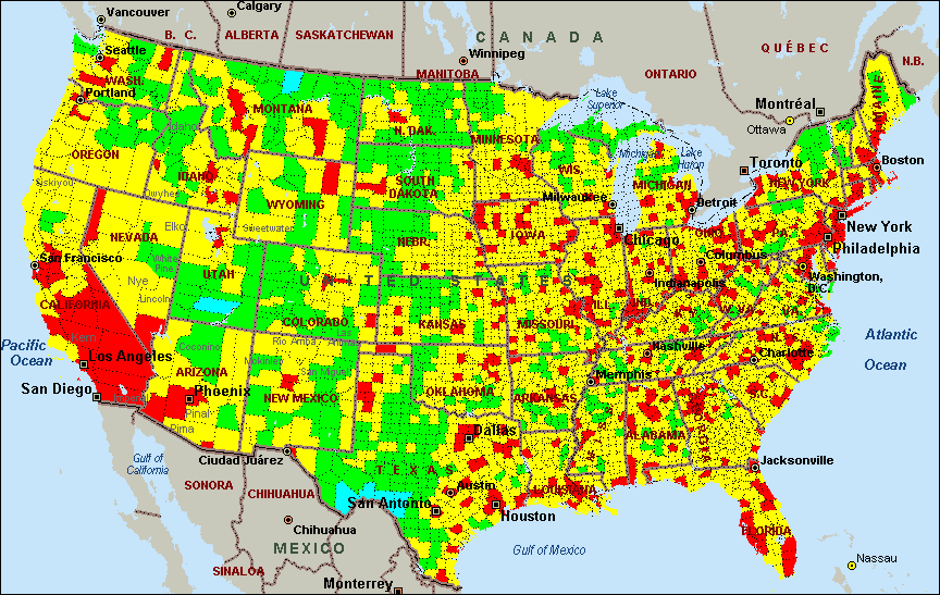
individuals may fabricate data on maps that is in favor of their operation. For example, recently Verizon posted two maps displaying both Verizon and AT&T 3G converge in the conterminous United States. Verizon’s map was far superior to AT&T’s map. Along these lines, the display of maps may have lead consumers to switch to Verizon for better service.
Though neogeography is unregulated, it allows users to share their own geographic creations with the World Wide Web. Many are able to appreciate the simplicity of sharing your relative data with photos and developing your own map to express your own individuality within your realm. There will always be those who use something to their advantage, but that should not disclaim the uniqueness of neogeography.


View Los Angeles Best Cupcake Spots in a larger map


Monday, October 15, 2012

USGS Togographic Map

1. What is the name of the quadrangle?
Beverly Hills Quadrangle
California-Los Angeles CO.

2. What are the names of the adjacent quadrangles?

Canoga Park, Van Nuys, Burbank, Topanga, Hollywood, Pacific Ocean, Venice, and Inglewood.

3. When was the quadrangle first created?
This quadrangle was first created in 2012.

4. What datum was used to create your map?
The following datums were used to create the map: North American Datum of 1983 (NAD83) and North American Vertical Datum of 1988.

5. What is the scale of the map?
1:24,000
(One inch on the map is equivalent to 24,000 inches on the ground)

6. At the above scale, answer the following:
a) 5 centimeters on the map is equivalent to how many meters on the ground?
1200.001 meters

b) 5 inches on the map is equivalent to how many miles on the ground?
1.894 miles

c) One mile on the ground is equivalent to how many inches on the map?
2.640 inches

d) Three kilometers on the ground is equivalent to how many centimeters on the map?
12.500 centimeters

7. What is the contour interval on your map?
Contour Interval 20 Feet

8. What are the approximate geographic coordinates in both degrees/minutes/seconds and decimal degrees of:
a) the Public Affairs Building
34°4’29”N, -118°26’21”W
34.074723, -118.439205

b) the tip of Santa Monica pier
34°00’29”N, -118°29’56”W
34.008056, -118.498889

c) the Upper Franklin Canyon Reservoir
34°7’10”N, -118°24’37”W
34.119452, -118.4103574

9. What is the approximate elevation in both feet and meters of:
a) Greystone Mansion (in Greystone Park):
550 feet
167.64 meters

b) Woodlawn Cemetery
140 feet
42.672 meters

c) Crestwood Hills Park
640 feet
195.072 meters

10. What is the UTM zone of the map?
UTM Zone 11

11. What are the UTM coordinates for the lower left corner of your map?
3,763,000 meters North
  361,500 meters East

12. How many square meters are contained within each cell (square) of the UTM gridlines?
1,000,000 square meters  

13. Obtain elevation measurements, from west to east along the UTM northing 3,771,000, where the eastings of the UTM grid intersect the northing. Create an elevation profile using these measurements in Excel (hint: create a line chart). Figure out how to label the elevation to the two measurements on campus. Insert your elevation profile as a graphic in your blog. 


14. What is the magnetic declination of the map?
14 degrees

15. In which direction does water flow in the intermittent stream between the 405 freeway and Stone Canyon Reservoir?
South

16. Crop out UCLA from the map and include it as a graphic on your blog.


Monday, October 8, 2012

Interesting Maps


United States Interstate System

The above map is retrieved from iStockphoto and is a representation of a physical feature displaying an important source of information. As the title implies, the map depicts the interstate system of the forty-right conterminous United States. The red lines symbolize the countless interstates in the United States. Each red line is accompanied with a shield which provides the interstate number, though it is difficult to see the numbers. Additionally, visible are green stars that represent the capitals of the forty-eight states. With the exception of a few capitals, the interstates run through the capitals. Thus, the hubs of all states are linked to one another. Moreover, the interstate system connects the East coast and the West coast. Most notable is the cluster of interstates in the Eastern portion of the United States which is vastly different than the disperse interstates visible in the Western portion of the U.S. Interestingly, the system links American populations with one another and with our neighbors, Canada and Mexico. Furthermore, the location of the interstates corresponds to the urban areas of America. This is significant because these areas are usually key economic and/ or political regions of the U.S.
United States of America Map. 2012. Map. iStockphoto LPWeb. 2 Oct 2012. <http://www.istockphoto.com/stock-illustration-2089672-united-states-of-america-map.php>.


United States Population Density 

This map is located on the National Database of GIS Data website and is a thematic map which is a map that focuses on a specific theme related to a specific geographic area. This particular thematic map emphasizes the spatial variation of geographic distribution, such as the population density of 1990. The map depicts American inhabitants per square mile of the conterminous United States. Located at the bottom left-hand corner is a legend that described what each color represents. The map illustrates the regions of America that are most populated. Most notably is the large cluster of heavily populated states located at the Eastern portion of America, specifically the Northeastern and the East North Central Midwest regions of the United States. California is notably because of its heavily populated regions per square mile. Moreover, the Midwest, the West South Central South, and the Mountain West are sparsely populated. The population density of 1990 is interesting because the population can be correlated with resource distribution and with other environmental factors, such as pollution. Moreover, this map can be associated to the interstate system map above. Notice that the densely populated regions of the Northeastern and East North Central Midwest have many interstates. Thus, we can assume that the interstates play a role in populations and regions that Americans choose to live.
Gisiger, Anne. Population Density - 1990. 1994. Map. A National Database of GIS DataWeb. 2 Oct 2012. <http://www.cast.uark.edu/local/catalog/national/images/maps/Population.dir/USpop1990.gif>.

United States Air Quality Map
United States Air Quality 
The third map featured in this blog is from Creative Methods which is a website that “provides scientific analyses for fundamental issues of our world” (United States, N.d.). The map presents the United States’ air quality based on twenty-one measures from the Environmental Protection Agency (EPA). Air quality of the conterminous Untied States is graded from A to F. An A grade indicates that these regions of the United States are the best and cleanest while an F grade implies that these regions are the worst and dirtiest in America. The following colors represent a specific air quality grade: dark blue signifies an A grade, light blue represents a B grade, lime green denotes a C grade, yellow corresponds to a D grade, and red symbolizes an F grade. Although the website did not indicate what year this data is from, most notable are the regions containing a D grade of air quality. These regions are located in densely populated areas, such as the Northeast and East North Central Midwest. Moreover, the sparsely populated regions of America have an average air quality grade, denoted by the lime green C grade. Yet, there are regions within the Midwest that received an F grade. If the population density map is layered with the air quality map, we will notice that the Midwest areas which are densely populated are also the dirtiest regions of America with respects to air quality. Furthermore, the state of California appears to be the dirtiest and contain the worst air quality of the nation. California is also densely populated with some regions contain 400 to 70,000 in habitants per square mile (refer to population density map above). The air quality map is significant because it allows researchers to view the most polluted areas of our nation and concentrate on improving air quality.
United States Air Quality. N.d. Map. Creative MethodsWeb. 2 Oct 2012. <http://creativemethods.com/airquality/maps/united_states.htm>.