 | ||
United States Interstate SystemThe above map is retrieved from iStockphoto and is a representation of a physical feature displaying an important source of information. As the title implies, the map depicts the interstate system of the forty-right conterminous United States. The red lines symbolize the countless interstates in the United States. Each red line is accompanied with a shield which provides the interstate number, though it is difficult to see the numbers. Additionally, visible are green stars that represent the capitals of the forty-eight states. With the exception of a few capitals, the interstates run through the capitals. Thus, the hubs of all states are linked to one another. Moreover, the interstate system connects the East coast and the West coast. Most notable is the cluster of interstates in the Eastern portion of the United States which is vastly different than the disperse interstates visible in the Western portion of the U.S. Interestingly, the system links American populations with one another and with our neighbors, Canada and Mexico. Furthermore, the location of the interstates corresponds to the urban areas of America. This is significant because these areas are usually key economic and/ or political regions of the U.S.United States of America Map. 2012. Map. iStockphoto LPWeb. 2 Oct 2012. <http://www.istockphoto.com/stock-illustration-2089672-united-states-of-america-map.php>.  United States Population Density
This map is located on the National Database of GIS Data website
and is a thematic map which is a map that focuses on a specific theme related
to a specific geographic area. This particular thematic map emphasizes the spatial
variation of geographic distribution, such as the population density of 1990.
The map depicts American inhabitants per square mile of the conterminous United
States. Located at the bottom left-hand corner is a legend that described what
each color represents. The map illustrates the regions of America that are most
populated. Most notably is the large cluster of heavily populated states located
at the Eastern portion of America, specifically the Northeastern and the East
North Central Midwest regions of the United States. California is notably
because of its heavily populated regions per square mile. Moreover, the
Midwest, the West South Central South, and the Mountain West are sparsely
populated. The population density of 1990 is interesting because the population
can be correlated with resource distribution and with other environmental
factors, such as pollution. Moreover, this map can be associated to the
interstate system map above. Notice that the densely populated regions of the Northeastern
and East North Central Midwest have many interstates. Thus, we can assume that
the interstates play a role in populations and regions that Americans choose to
live.
Gisiger, Anne. Population
Density - 1990. 1994. Map. A National Database of
GIS DataWeb. 2 Oct 2012.
<http://www.cast.uark.edu/local/catalog/national/images/maps/Population.dir/USpop1990.gif>.
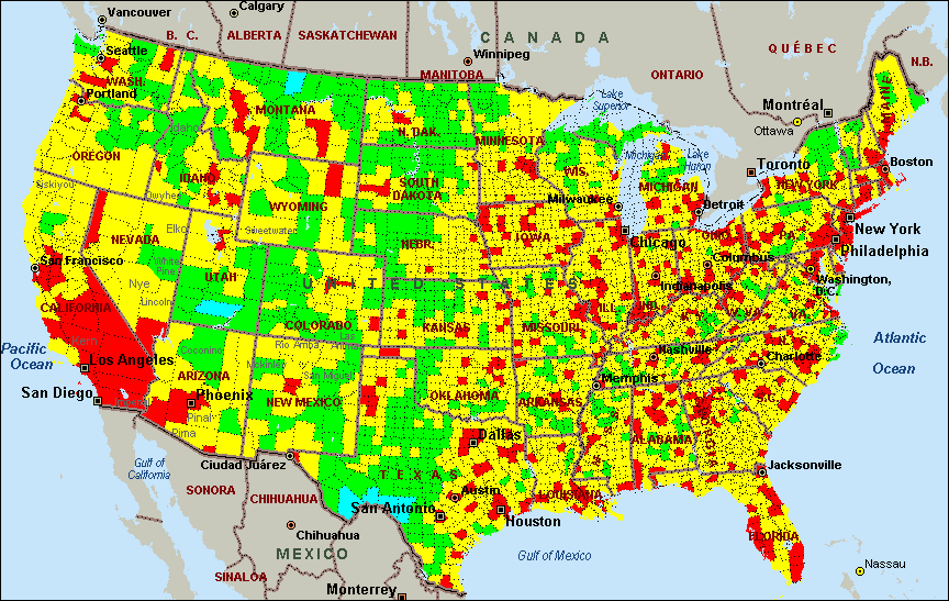
United States Air Quality
The third map featured in this blog is from Creative Methods
which is a website that “provides scientific analyses for fundamental issues of
our world” (United States, N.d.). The map presents the United States’ air quality
based on twenty-one measures from the Environmental Protection Agency (EPA).
Air quality of the conterminous Untied States is graded from A to F. An A grade
indicates that these regions of the United States are the best and cleanest while
an F grade implies that these regions are the worst and dirtiest in America. The
following colors represent a specific air quality grade: dark blue signifies an
A grade, light blue represents a B grade, lime green denotes a C grade, yellow
corresponds to a D grade, and red symbolizes an F grade. Although the website did
not indicate what year this data is from, most notable are the regions containing
a D grade of air quality. These regions are located in densely populated areas,
such as the Northeast and East North Central Midwest. Moreover, the sparsely populated
regions of America have an average air quality grade, denoted by the lime green
C grade. Yet, there are regions within the Midwest that received an F grade. If
the population density map is layered with the air quality map, we will notice
that the Midwest areas which are densely populated are also the dirtiest regions
of America with respects to air quality. Furthermore, the state of California
appears to be the dirtiest and contain the worst air quality of the nation.
California is also densely populated with some regions contain 400 to 70,000 in
habitants per square mile (refer to population density map above). The air
quality map is significant because it allows researchers to view the most
polluted areas of our nation and concentrate on improving air quality.
United
States Air Quality. N.d. Map. Creative MethodsWeb.
2 Oct 2012.
<http://creativemethods.com/airquality/maps/united_states.htm>.
|
Monday, October 8, 2012
Interesting Maps
Subscribe to:
Post Comments (Atom)
No comments:
Post a Comment